Exercise 1: Mixed messages. Enjoy your stay: written in a Gothic font. Gives the impression horror fans would enjoy their stay. Good for a themed hotel, but only if the theme is ‘Stay awake tonight’. DO NOT FEED THE ANIMALS THEY ARE DANGEROUS: written in a serif font. We are used to warning signs being sans-serif in bold letters. This seems that the writer is a danger to punctuation. We are professionals: written in a typewriter font. Could be professional secretaries. That said, professional Screenwriters also use such a font and not doing so shows a screenwriter up as not understanding this rule. LUXURY: in a modern, slightly Aztec-looking font. Luxury is a subjective concept, so if this was on a bar of soap or on a spa menu, this might look well-placed, but context would dictate whether or not this would work. hand made: in a functional, san-serif font, maybe Arial. This font says anything-but-handmade. One would normally expect to see a font that could, conceivably, be hand-written.
Exercise 2: re-contextualising images.

Exercise 3: film posters. I have chosen the poster from the 1977 James Bond film The Spy Who Loved Me to illustrate the use of the film poster to give prospective, cinema-goers an idea of what their money and time will buy. The Bond franchise is a well-known and iconic brand and the style is familiar, promising action and exotic locations, which would have seemed glamorous in a time when international travel was less common. I note the feature of the Lotus Esprit car, actually built to be amphibious (although by all accounts it leaked terribly). I was, as a child, very taken with this.
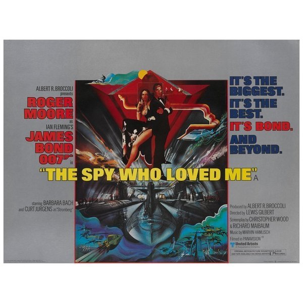
I remember my local branch of WH Smith making a promotional display using this poster in 1977. I was uncharacteristically bold to persuade them to give me this original cinema poster when the display came down. I don’t know what became of the poster, which is a shame, because the image above is from an advert for an original now on sale for well over £700.
